Creating an IoT Fleet Management Solution using Splunk
A week ago, I had the privilege of attending the annual Splunk Partner Technical Symposium in New Orleans along with a colleague. At this event, we entered and won the 1st annual IoT Hackathon, sponsored by AWS. The Hackathon tasked us with developing an IoT fleet management solution using Ford GoBike IoT (Internet of Things) data. This post outlines the developed solution and the various data sources and tools we used. Overall, it was a great and fun exercise and helps illustrate how feature rich solutions can be developed in a very short amount of time using Splunk Enterprise.
About the Solution
The solution we designed was framed around the concept of helping someone operationally manage a fleet of rental bicycles in San Francisco. The solution was split into three main focus areas:
- A Fleet Operations view provides real-time, actionable insight into the current health and management of the bicycle fleet and stations.
- A Station Insights view provides both real-time and historic insight for a specific bike station.
- A Fleet Trends view provides reporting, trending and insight using data from past bicycle rentals.
The views are explained in detail below and screenshots are provided. At the bottom of this post, I have also posted the various data sources and software that we used to develop the solution.
Fleet Operations
The Fleet Operations view leverages real-time data about the GoBike station fleet, to provide actionable operational insight. A screenshot follows, with a description below.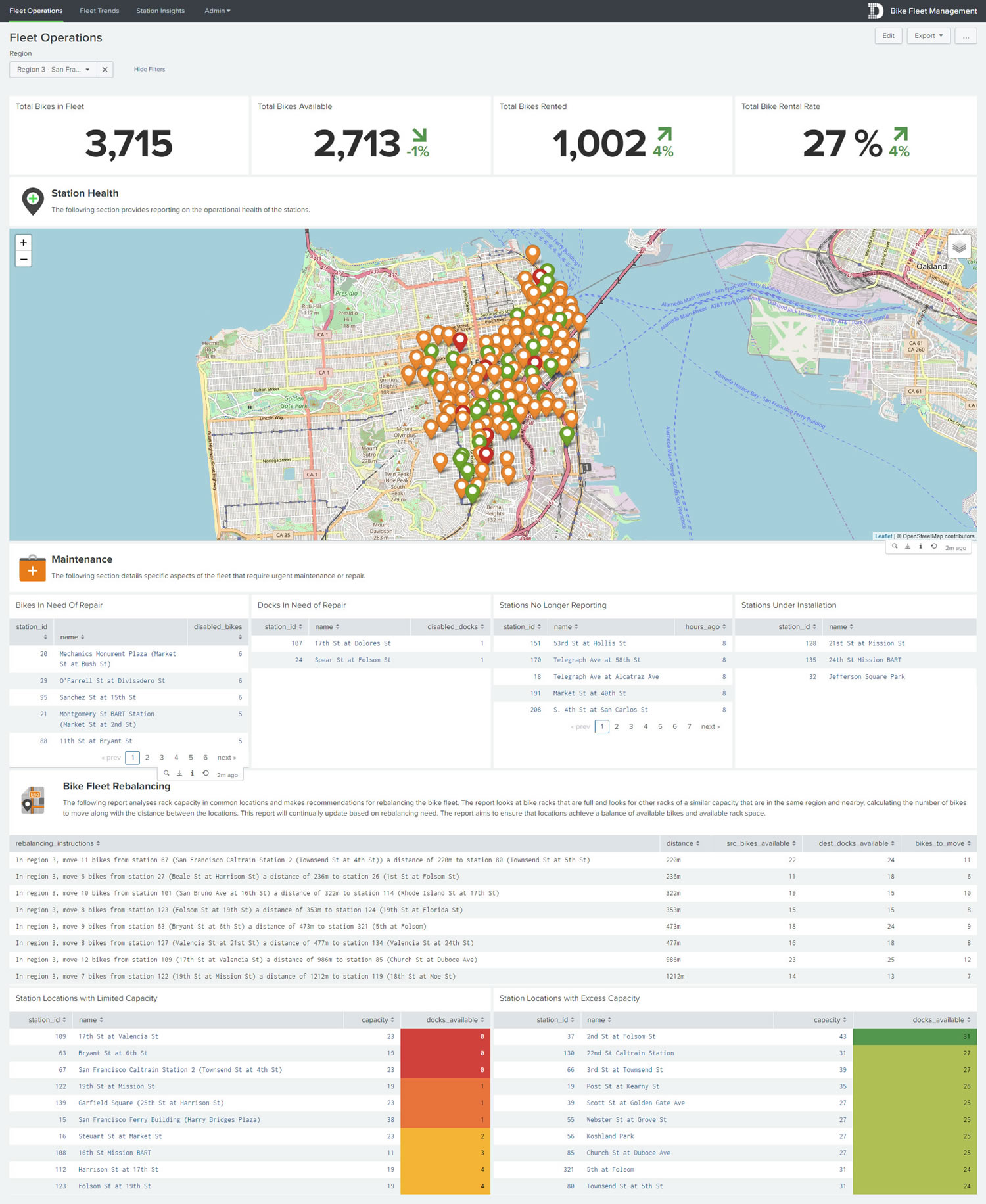
The view is filterable by region (e.g. San Francisco, San Jose, Oakland etc.) and all panels allow for drill-down into the Station Insights view. Various single-value metrics are presented across the top to help provide a snapshot of current rental activity.
The Station Health section provides a visual representation of the bicycle stations in a given region or all regions. The stations are colour coded based upon their overall health. Different metrics were designed to calculate the overall health of a given station. The metrics we designed were: bikes in need of repair, docks in need of repair, stations no longer reporting and stations under installation. Stations represented as green on the map passed all metrics, orange stations failed one metric and red stations failed more than one metric. The user can hover over a given station to see which metrics have passed and/or failed and get other pertinent information.
The Maintenance section, provides reporting on each individual metric, to help the fleet manager understand which stations require maintenance or repair.
The Bike Fleet Rebalancing section analyses rack capacity in common locations and make recommendations for re-balancing the bike fleet. Re-balancing may be required if all the docks in a specific station are completely full, as no more bikes can be returned to that location until a dock opens up. A report identifies bike racks that are full and finds other near-empty racks of a similar capacity in the same region that are nearby; calculating the number of bikes to move, along with the distance between locations. The output of the report spells out exactly what bikes to move from one station to another and is intended to be provided to a van driver on the ground who is responsible for re-balance the bikes. The report will update in real-time, depending on balancing need. Other reports in this section provide insight into the stations that actively have no capacity (i.e. no docks are available) and stations that have excess capacity (i.e. have many docks available).
Station Insights
The Station Insights view uses a mix of real-time and historic route data to provide drill down insights into a user filterable GoBike station. A screenshot follows, with a description below.

The view is filterable by region (e.g. San Francisco, San Jose, Oakland etc.) and by a specific station ID/location. The station will be automatically populated if a user has drilled-down to this view from the Fleet Operations view. Various single-value metrics are presented across the top to help provide a snapshot of station health and rental activity.
The Station Information section provides details specific to the station itself; including real-time weather details, capacity and location.
The Station Location section provides a intersection level view of the station location on a map. Users can zoom in and out as needed.
The Station Metrics section provides insight into the most popular routes from the particular location. This is represented both in a table and also graphically, using a ‘missile-map’ type visualization to illustrate the top routes and lengths. A final area chart provides a view into station utilization rate over time.
Fleet Trends
The Fleet Trends view predominantly uses route data from the past 15 months to provide trending and predictive insights into bike usage. A screenshot follows, with a description below.
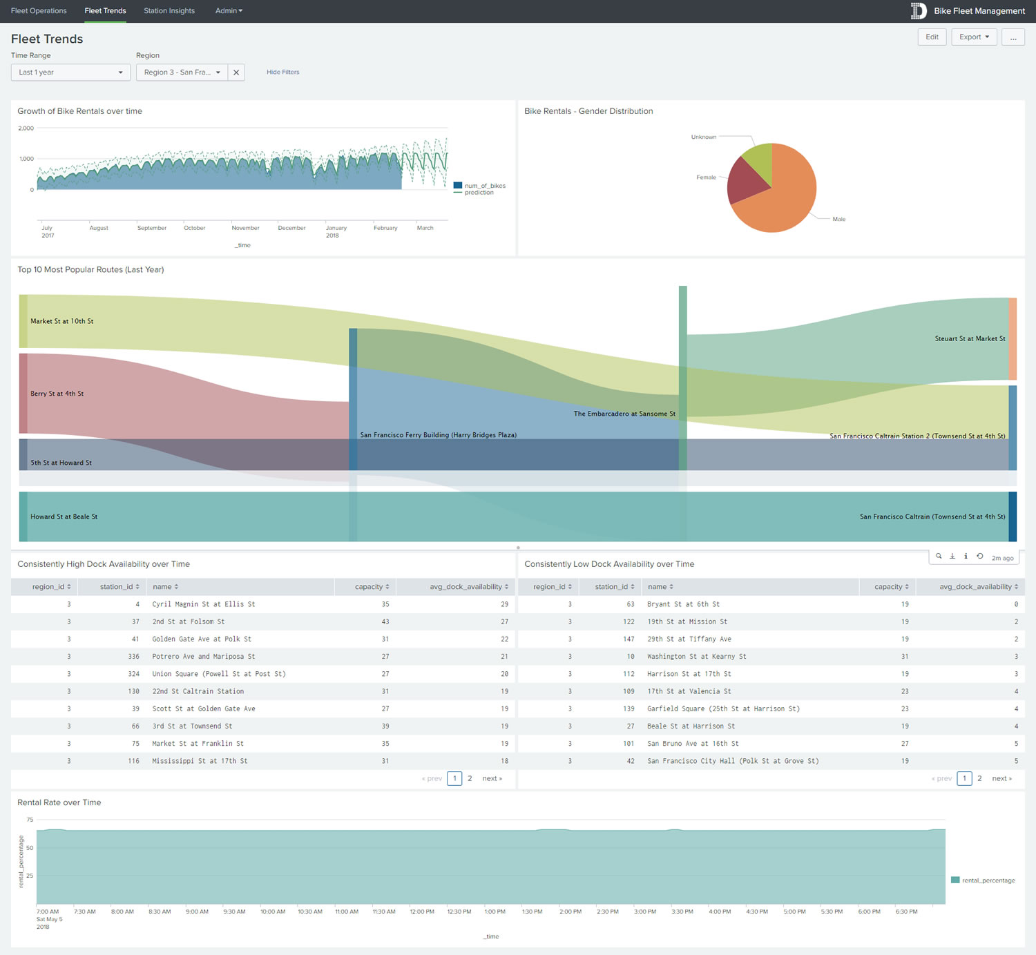
The view is filterable by region (e.g. San Francisco, San Jose, Oakland etc.) and by time range (e.g. Last 1 year). A report is provided to show the growth of bike rentals over time and predict the next two months growth, using an algorithm from the Splunk Machine Learning Toolkit (MLTK).
Gender distribution is provided in the form of a simple pie chart.
The top 10 most popular routes are visualized through the use of a Sankey diagram, to illustrate the to and from locations and the volume of trips.
Reports are provided to show stations that have consistently high or low dock availability over time. If a station has consistently high dock availability, it might be a very popular location for rental and may benefit from dock expansion in the future. If a station has consistently low dock availability, it may be an unpopular location and may benefit from relocation or downsizing. There are plenty of other variables that could be at play here, but time did not allow for further analysis.
The final chart illustrates the overall rental rate of the fleet over time – this is the amount of bikes that are rented out on average over time as a percentage of the entire fleet.
Data Sources and Tools
Infrastructure:
– Amazon Web Services
Software:
– Splunk Enterprise 7.1
– Splunk Machine Learning Toolkit (MLTK)
– Rest Modular Input
Data Sources:
– Real-time weather data from Weather Underground
– Real-time bike station and information data from Ford GoBike data
– Historic trip history data for the past 15 months from Ford GoBike data
Custom Visualizations:
– Clustered Single Value Map Visualization
– Missile Map
– Sankey Diagram
– Various out-of-the-box visualizations
Looking to expedite your success with Splunk? Click here to view our Splunk service offerings.
© Discovered Intelligence Inc., 2018. Unauthorised use and/or duplication of this material without express and written permission from this site’s owner is strictly prohibited. Excerpts and links may be used, provided that full and clear credit is given to Discovered Intelligence, with appropriate and specific direction (i.e. a linked URL) to this original content.


